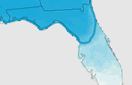


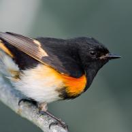
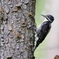


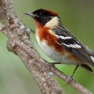
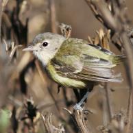
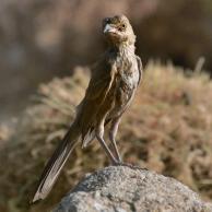


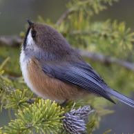
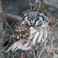
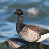
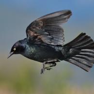


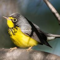
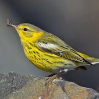


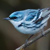
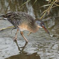
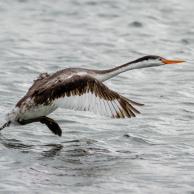
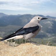
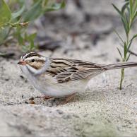
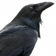


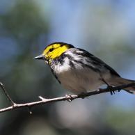
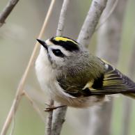
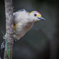

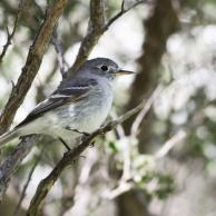


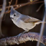
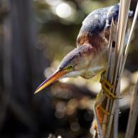


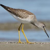

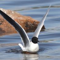


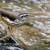
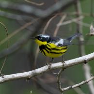
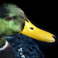
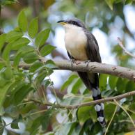
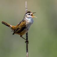
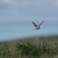
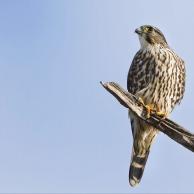
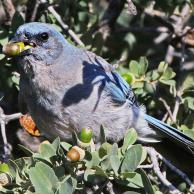

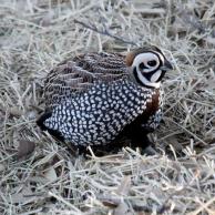
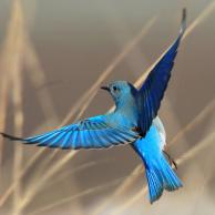


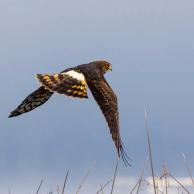


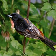


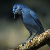
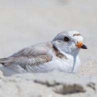
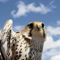


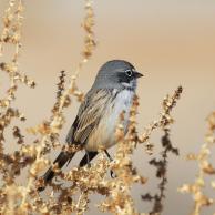

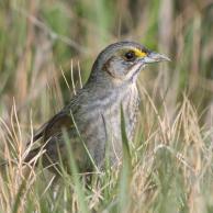
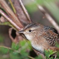
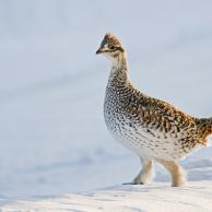


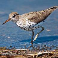
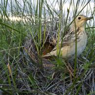


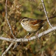


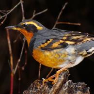
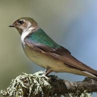
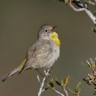
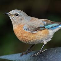
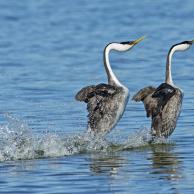


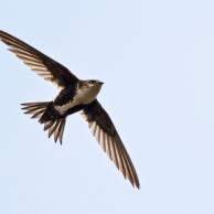

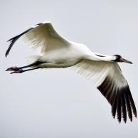

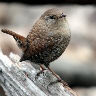


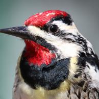

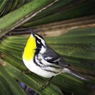
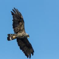
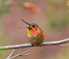
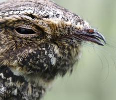
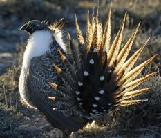
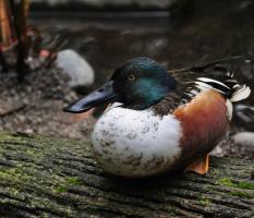
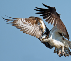
Each map is a visual guide to where a particular bird species may find the climate conditions it needs to survive in the future. We call this the bird’s “climatic range.”
The colors indicate the season in which the bird may find suitable conditions— blue for winter, yellow for summer (breeding), and green for where they overlap (indicating their presence year-round).
The darker the shaded area, the more likely it is the bird species will find suitable climate conditions to survive there.
The outline of the approximate current range for each season remains fixed in each frame, allowing you to compare how the range will expand, contract, or shift in the future.
The first frame of the animation shows where the bird can find a suitable climate today (based on data from 2000). The next three frames predict where this bird’s suitable climate may shift in the future—one frame each for 2020, 2050, and 2080.
You can play or pause the animation with the orange button in the lower left, or select an individual frame to study by clicking on its year.
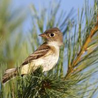
The darker the color, the more favorable the climate conditions are for survival. The outlined areas represent approximate current range for each season. More on reading these maps.
The darker the color, the more favorable the climate conditions are for survival. The outlined areas represent approximate current range for each season.
More on reading these maps.
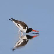
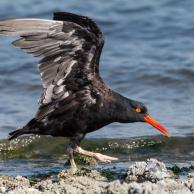
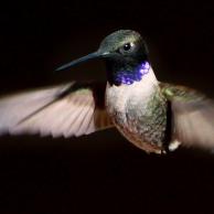
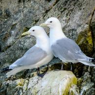
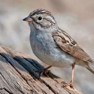
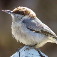
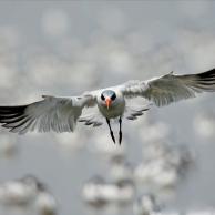
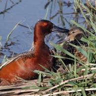
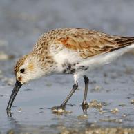
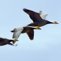
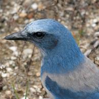
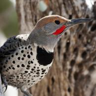
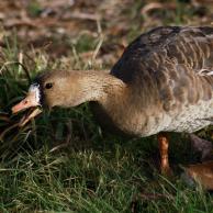
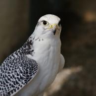
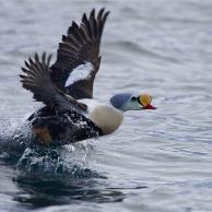
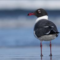
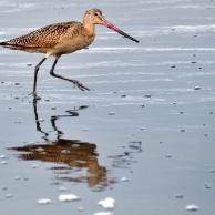
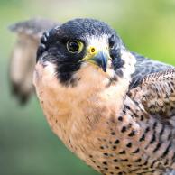
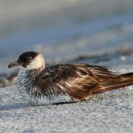
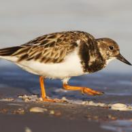
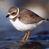
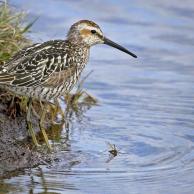
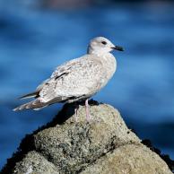
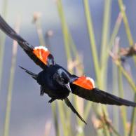
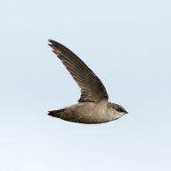
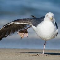
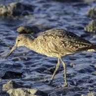
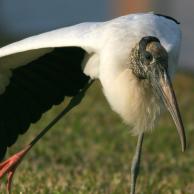
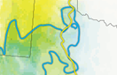
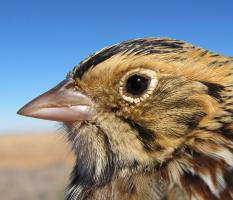
This hulking shorebird is restricted to beaches and salt marshes in the immediate vicinity of ocean shores. The species is partially migratory, with many individuals moving north along the coast in spring to breed. The most striking aspect of Audubon's climate model concerns the winter range, forecasting overall loss of suitable climate space, but also projecting extensive colonization of the southwestern U.S., Atlantic Canada and, even more remarkably, the eastern Great Lakes. Given the American Oystercatcher’s specialized diet of bivalves and other marine invertebrates, either it or its food source would have to rapidly adapt to newly created areas of suitable climate in the eastern Great Lakes.
Are the projected range maps different from the range maps in field guides? Find the answer here.
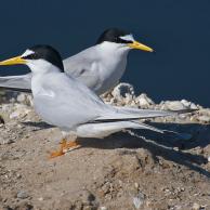
The size of the circles roughly indicates the species’ range size in 2000 (left) and 2080 (right).
The amount of overlap between the 2000 circle and the 2080 circle indicates how stable the range will be geographically. Lots of overlap means the bird’s range doesn’t shift much. No overlap means the species will leave its current range entirely.
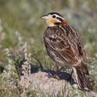
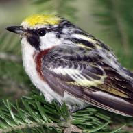
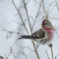
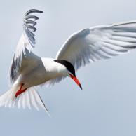
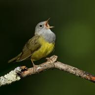
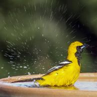
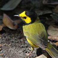
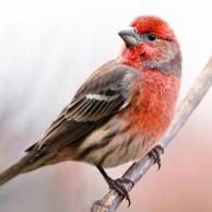
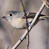
Explore more birds threatened by climate change around the country.


It's easier than you think to make a difference. Become an Audubon member today to help birds facing climate change.